Mockups
Written by Matej Gašperič
Architect
“In manufacturing and design, a mockup, or mock-up, is a scale or full-size model of a design or device, used for teaching, demonstration, design evaluation, promotion, and other purposes.”
Source: Wikipedia
Dimensions could be very deceiving.
While drawing on the paper, it is sometimes really hard to imagine, how some physical dimensions would appear in the 1:1 scale. It is even harder to envision how some elements would look like in composition with some other. And drawing on a computer, with its infinite zoomins and outs, just makes the situation much worse.
Personal first hand experience is probably the only way to successfully handle this problem in advance.
But even the most prominent and experienced architects, shamelessly extensively use mockups and prototypes in order to avoid ugly (and sometimes costly) mistakes.
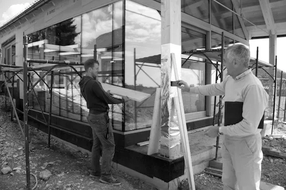
Studying the mockup of a (almost) horizontal thick version fixed shades.
Fixed horizontal shade mockup glued from two wooden plates.
Although one would usually prefer a bit more slim elements, a construction factors and weather resistance should also be taken into an account.
Fixed vertical shades mockup to study various thickness.
Something that, on a paper, would appear to be unexpectedly thick…
… appears more than acceptable when seen a s part of a whole.
There is nothing better than a client that cares.
And a mockup of a thin version of a horizontal fixed shade. Almost too thick on a paper, it was quite obvious on site, that this would simply not do the trick.
Facade plaster mockup in order to be sure that we all understood each other regarding the desired texture.
Old farm houses in Gorenjska (Slovenia), used to have a very specific, rough texture of plaster. And although it was probably due to the moisture damage, it felt only suitable for us to try to imitate it for the House R.
Matej Gašperič
Architect


